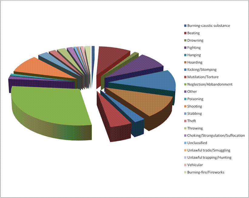
This is a percentage breakdown of all the different types of animal cruelty.
You can clearly see that neglect/abandonment is the most common form of abuse.
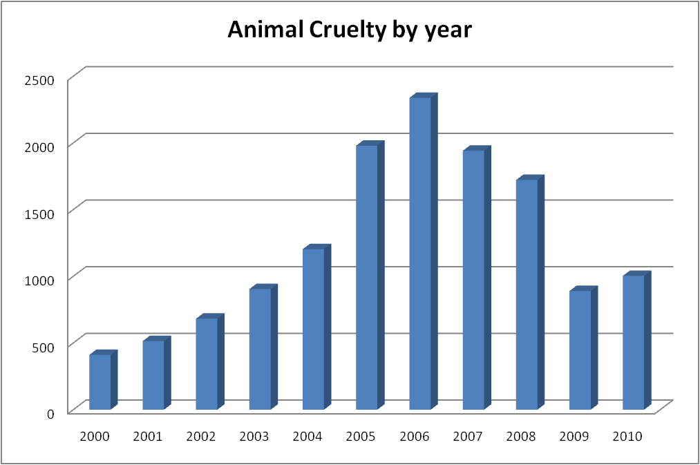
This graph shows that animal cruelty has been on the rise, until now.
This graph shows the amount of sharks poached per year.

This graph shows that leopard poaching peaked in the year 2000 and then decreased massively.

it is clear that tiger poaching was also at its highest in the year 2005, from the graphs above and below we can assume that the poaching of big cats was greatly affected by either new laws or a largely succesful campaign

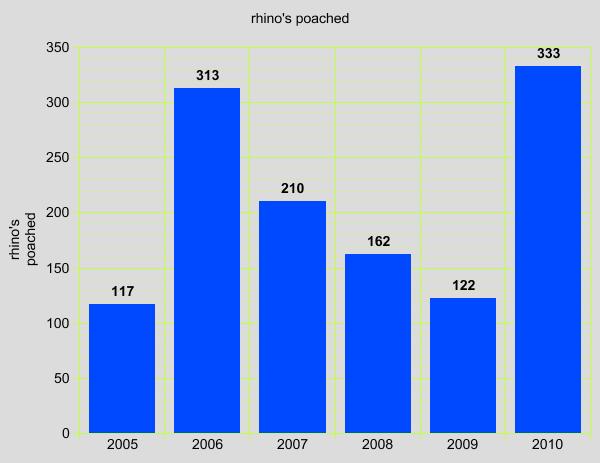
This graph shows that rhino poaching peaked in 2010 this is due to a rise in demand for medicine made from ivory, the same material that a rhino horn is made of.